Nordisk and the Tableau Aesthetic
David Bordwell
June 2010
The years from 1910 to 1920 saw more far-reaching changes
than did any other era in film history. The film industry developed many
of its prototypical structures and strategies, such as vertical integration and
division of production labor. Cinema acquired a central role in popular entertainments
while winning the loyalty of an intelligentsia. By influencing tastes and behavior
on a mass scale, cinema became a powerful social force. Not least, films began
to display formal and stylistic qualities that would define much of the medium’s
artistic history.
This period
coincides with the rise and decline of Nordisk Films Kompagni. As essays in the
collection 100 Years of Nordisk Film indicate, Ole Olsen’s firm became
a major player in a world market that was undergoing a critical phase of development. 1 Nordisk
took its place alongside Pathé and Gaumont as a major producer and distributor. 1 Nordisk
took its place alongside Pathé and Gaumont as a major producer and distributor. 2 Granted,
smaller Danish companies sometimes proved more innovative: Kosmorama with the
Asta Nielsen sensation Afgrunden (1910), Fotorama with the 700-meter White
Slave Trade (1910), Dansk Biografkompani with Benjamin Christensen’s extraordinary Mysterious
X (1913) and Hævnens Nat (1915). But Nordisk had the resources
to capitalize on these firms’ efforts and standardize them. Benefiting from a
stable of skilful directors, Nordisk was able to create films that exemplify
the range of aesthetic resources during this crucial decade. 2 Granted,
smaller Danish companies sometimes proved more innovative: Kosmorama with the
Asta Nielsen sensation Afgrunden (1910), Fotorama with the 700-meter White
Slave Trade (1910), Dansk Biografkompani with Benjamin Christensen’s extraordinary Mysterious
X (1913) and Hævnens Nat (1915). But Nordisk had the resources
to capitalize on these firms’ efforts and standardize them. Benefiting from a
stable of skilful directors, Nordisk was able to create films that exemplify
the range of aesthetic resources during this crucial decade.
Film historians
have pointed out Nordisk’s accomplishments in cinematic storytelling, especially
the modulated performances of Asta Nielsen, Valdemar Psilander, and their peers,
along with the painterly use of light, as here in Alone with the Devil (Ekspressens
Mysterium, 1914).
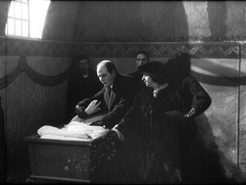
We can also find early uses of close-ups, crosscutting,
and scene dissection in Danish cinema. Here and elsewhere, these editing-based
techniques, historians argued, replaced the purportedly heavy tableaux of “theatrical” cinema.
By 1919, throughout the world, silent cinema seemed to have found its mature
form, and Danish directors played a crucial part in the enterprise.
The evidence
is now overwhelming, however, that the editing-driven account of film technique
is one-sided. The international “theatrical” style of the 1910s was
far more complex than many historians allowed. As an aesthetic system, it was
based on the idea of the shot as a rich totality. Setting, lighting, camera position,
and figure movement created an expressive image that ripened through time. The
most ambitious 1910s tableaux exercised the viewer’s eye in ways we have still
not fully appreciated, and Nordisk played an important role in this staging-based
approach to filmic storytelling.
2D and 3D
The primary
task of the 1910s long-take shot is to guide the viewer’s visual search.
The director must steer our attention to key items of information. This might
seem a simple task: Put items of importance in the center, face your characters
toward the viewer, make sure the image is clear. But as the drama of the scene
develops, there emerges what Charles Barr calls a gradation of emphasis. 3 The
filmmaker must find ways to highlight some elements and downplay others, which
may eventually rise to greater importance. Thus the filmmaker will have to master
a repertoire of visual devices that will shape the viewer’s attention across
the scene. Moreover, some useful techniques also cause problems. To emphasize
one actor, you can move the camera closer. Carl Dreyer recalled that around 1912,
the twelve-foot line mandated for the camera position was modified to a nine-foot
one (the position characteristic of US practice). 3 The
filmmaker must find ways to highlight some elements and downplay others, which
may eventually rise to greater importance. Thus the filmmaker will have to master
a repertoire of visual devices that will shape the viewer’s attention across
the scene. Moreover, some useful techniques also cause problems. To emphasize
one actor, you can move the camera closer. Carl Dreyer recalled that around 1912,
the twelve-foot line mandated for the camera position was modified to a nine-foot
one (the position characteristic of US practice). 4 But
a closer performer blocks out more of the background, perhaps masking other players.
Still, you can turn this problem to your advantage by having the foreground character
conceal something that we don’t need to see at the moment, and move aside
when necessary. Through the cascade of problems and solutions, 1910s directors
refined a remarkable array of techniques of composition and choreography. 4 But
a closer performer blocks out more of the background, perhaps masking other players.
Still, you can turn this problem to your advantage by having the foreground character
conceal something that we don’t need to see at the moment, and move aside
when necessary. Through the cascade of problems and solutions, 1910s directors
refined a remarkable array of techniques of composition and choreography.
The dramatic space of any film image is at once a two-dimensional composition
and a three-dimensional acting arena. Filmmakers of the 1910s realized that the
film frame offered all the resources of painterly design and emphasis, with the
extra resource of duration. A shot could be balanced, thrown off balance, and
rebalanced, with powerful impact on the story action. The composition could draw
attention to faces, hands, and other areas that are informative about story action.
At the same time, great expressive possibilities came from the deep cinematic
playing space. This tapers toward the lens, creating an optical pyramid quite
different from the broad but relatively shallow area of the proscenium stage.
The filmmaker could make movement toward the foreground eye-catching, exaggerate
the players’ size or distance from one another, create a shifting dynamic between
players at different distances from the camera, and have closer figures block
and reveal key action in the distance. If we watch closely, “theatrical” films
of the 1910s are a marvelous revelation of what the sustained shot can do.
Not least, the Nordisk films. True, they have the reputation of heaviness, and
they do exhibit quite long takes (16-42 seconds, on average, in the ones I’m
considering). They can also seem a little padded in their plotting, particularly
in the later teens. But a great many Nordisk films resourcefully exploit the
sustained image as two-dimensional grid and three-dimensional optical pyramid.
The options
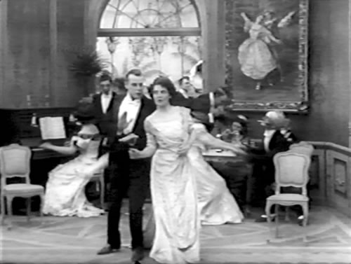
emerged early. The Fotorama version of The White Slave Trade (1910)
exhibits moderately close and shallow staging. The White Slave Trade I (Den
Hvide Slavehandel I, 1910), August Blom’s copycat version
for Nordisk, relies on distant and lateral staging, often employing quite simple
symmetry.
But in a 1911 sequel, The White Slave Trade II: The White Trade’s Last
Victim (Den
Hvide Slavehandel II, or Den Hvide Slavehandels siste Offer), Blom handles
the same situation quite differently. The kidnapped Edith comes down to the brothel
party, centered and framed by the doorway.
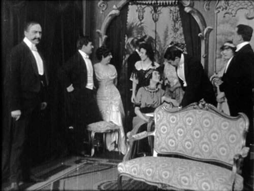
Edith is brought to the right foreground and settled on the sofa, talking to
Williams, just as Lord X enters in the background.
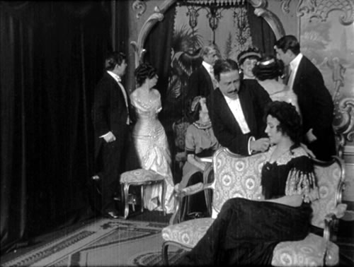
After greeting Edith, Lord X moves to the left foreground to negotiate with the
brothel-keeper Bright about buying her.
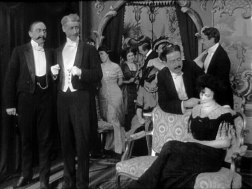
In all, a zigzag layout tucks dramatic action into several areas of the shot—foreground,
background, and sides. This sort of diagonal array would become more common across
the decade.
Even when
a filmmaker staged the action in more lateral arrays, he tended to pack the parallel
planes with more information than a 1910 shot would. During the courtroom climax
of The Mystery of the Express, director Hjalmar Davidsen fills the frame
with parallel layers of figures.

In the foreground stand the prosecutor and Frédéric
(on the right). The judge, the crucial witness, and Frédéric’s
attorney dominate the middle ground. In the crowd of spectators in the rear,
we can see Frédéric’s
wife, framed in the arch and peeping out over the attorney’s shoulder.
Compare the relatively thin and remote parallel planes in The White Slave
Trade I above.
Through planar or diagonal staging, then, the frame often
articulates several zones of action. But this doesn’t typically make the
composition diffuse or distracting. Often
the players simply hold their positions in different zones long enough for us
to register the interplay among them, as in the examples just noted. Often as
well, the zones will shift in importance from moment to moment. The simplest
method of emphasis is to bring the player to the foreground, as when in The
White Slave Trade’s Last Victim, the kidnapped slave-traffic victim
is ushered to the sofa (above).
If a figure doesn’t advance to the camera, it can acquire visual weight in other
ways. Perhaps lighting accentuates the more distant figure. Or the player who
is nearer to us can be set to one side and the distant player can be more central.
Or, as the distant figure enters the shot, the near actor can remain motionless,
or turn away from us; even if the background player isn’t centered, either
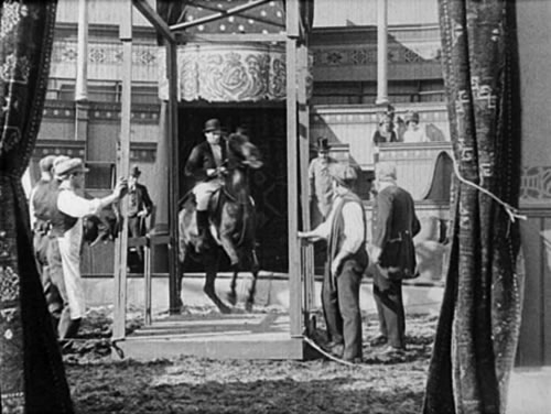
choice will draw our attention to her. Or the distant actor can be framed in
a doorway or window. This effect is common in some of the bigger stages Nordisk
employed, as in The Great Circus Catastrophe (Dødsspring
til Hest fra Cirkuskuplen, 1912). Using Nordisk’s vast circus set, Edward Schnedler-Sørensen
encloses his protagonist in a series of central frames to highlight his stunt.
These strategies can combine to strengthen a single zone. For The Maharajah’s
Favorite Wife (Maharadjahens Yndlingshustru, 1917) Robert Dinesen
used several cues to highlight Elly as she enters the Harem.
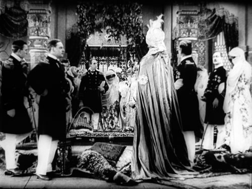
She is marked through centering, forward movement (and an unmoving foreground),
internal framing (the arch, the foreground figures), and the fact that several
characters, including the most commanding foreground figure, the Maharajah on
foreground right, turn from the camera. Kuno, the officer in the foreground looking
to the right, could also have been turned fully away, but he becomes a secondary
point of emphasis, as we wait for him to discover that she is his former fiancée.
As we’ll see later, such cues can be shared out among several actors, with
one centered, another closer to the camera, a third framed in an aperture, and
so on.
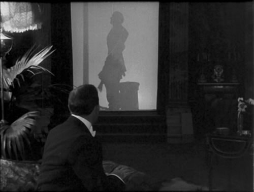
The aperture
effect can be amplified by the scale of the set and some dramatic lighting, as
we see during John’s seduction by the society woman in Temptations
of a Great City (Ved Faengslets Port, 1911). As she coyly undresses
behind a screen, the image becomes a play of shadow, central positioning, and
architectural framing.
In Nordisk’s The Ballet Dancer (Balletdanserindin, 1911)
August Blom sets the stage performance in the distance and the offstage action
in the foreground. When Jean calls on Camilla at the theatre, the camera position
puts us with him in the wings.
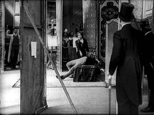
The camera setup from the wings fits the general attachment of the scene’s orientation
to the playboy Jean rather than the heroine Camilla. Even more flashy is the
moment when Camilla accepts her applause: a strip of space on the very far left
is segregated to show her bowing.
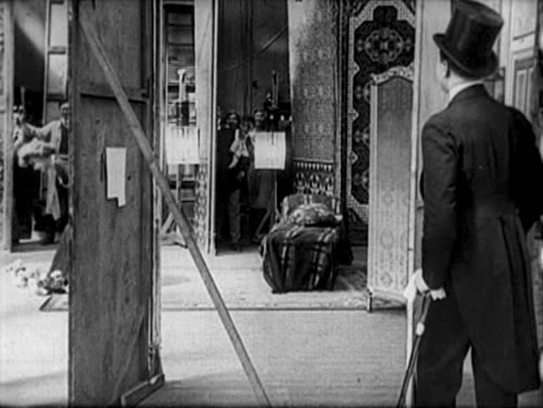
These staging patterns play out over minutes, with the pictorial effects primed,
delayed, and fulfilled. Usually the artistry is unobtrusive, so the viewer is
unlikely to notice how the imagery has been sculpted to assure smooth dramatic
continuity. Just before the hero of The Clown (Klovnen, 1916)
casts out his wife, we have seen his assistant bustling around in the dressing
room, so we know he’s present. But at the moment Joe rejects Daisy, his
body conceals the servant, and our attention fastens on the interplay between
husband and wife.
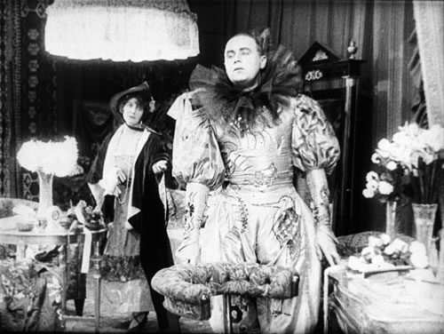
Daisy turns away and departs, letting Joe’s expression and posture dominate
the frame.
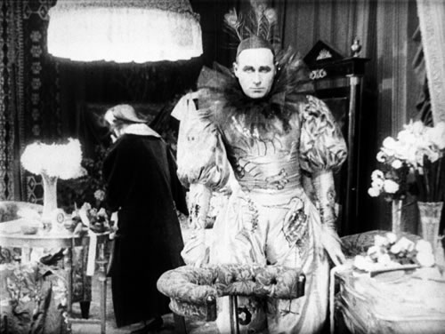
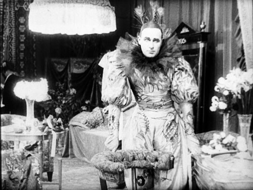
Then Joe swivels just as the assistant emerges from behind
him and begins to prepare him for the performance.

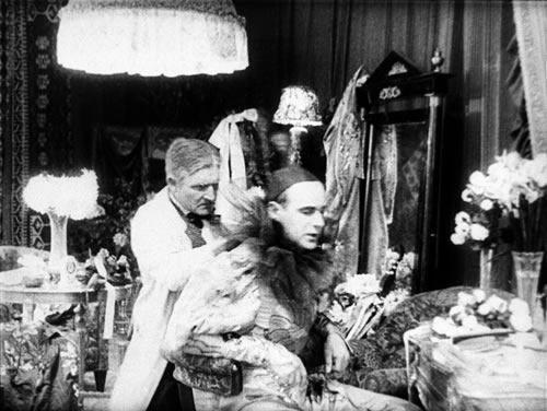
Director A. W. Sandberg decided not to give the assistant
a visible reaction to the moment, simply erasing him in order to highlight the
central dramatic exchange.
This tactic
of block and revealing points up the power of the pyramidal playing space of
cinema. If the Clown scene were played on a theatre stage, spectators
in the center area of seats might have their view of the assistant blocked correctly,
but other spectators in other seats would see him throughout the scene. In proscenium
theatre, the director must arrange the scenes laterally, so that various parts
of the auditorium can see everything relevant. But cinema offers only one viewpoint,
and because of optical projection scenes can be played in much more calculated
depth. An amusing demonstration can be found in Pat Corner, a 1909 Nordisk
release.
Detective
Pat Corner has solved the case and the bank executive comes to his office to
thank him. The manager strolls in to shake Pat’s hand.
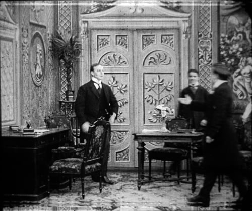
The executive blocks the young office boy, a character of no importance.
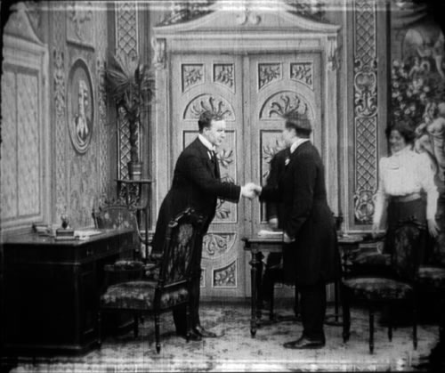
But the actor playing the office boy thinks he deserves
to be seen, so he brashly steps backward to bring himself into view.
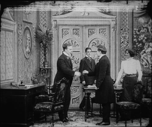
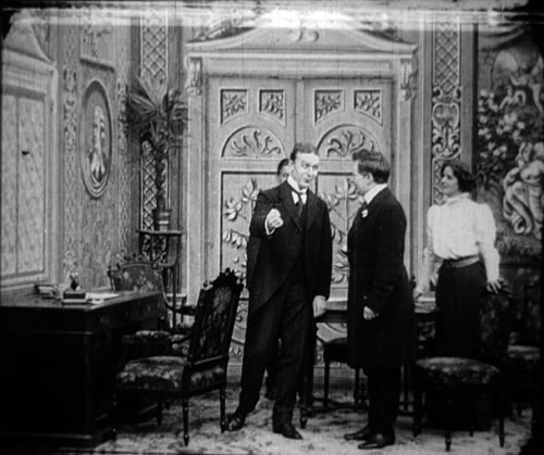
The actor playing Pat steps to the center, masking the
lad off again.
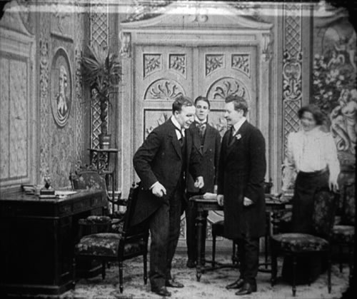
But the young actor isn’t giving in; he’s evidently
learned that if you can see the camera, the camera can see you. As Pat completes
his movement, the boy edges to the right to assure himself a good spot in the
shot.
Such self-promoting
maneuvers wouldn’t be seen in theatrical staging, which doesn’t rely
on a single axis of visibility the way cinema does. But soon directors learned
to exploit the power of slight blocking and revealing. Three years later, in
Edward Schnedler-Sørensen’s A Modern Girl (Vor Tids
Dame, 1912) these slight movements become dramatically significant. Anny
has helped the disgraced chauffeur Hans to be reinstated in the household, and
he comes to thank her. She starts to flirt with him.
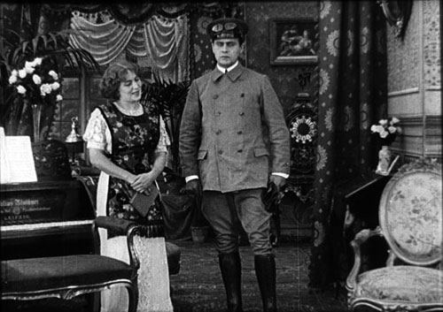
As she moves her head toward him, her top-hatted suitor
Pullman becomes slightly visible behind her right shoulder, watching from the
French windows behind them.
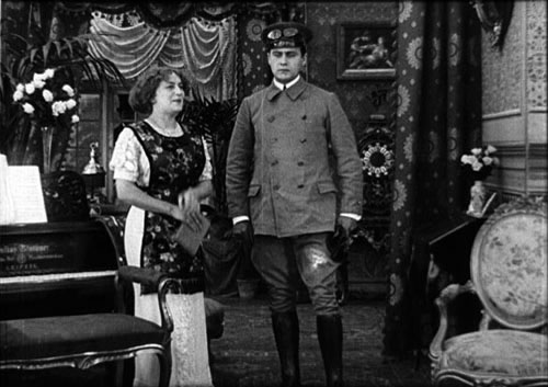
Hans turns a bit toward Anny and she coyly moves a little to meet him. In the
process, she reveals Pullman more clearly.
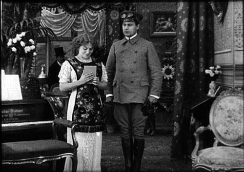
Now those spectators who didn’t spot Pullman in the earlier moment can’t
miss the fact that he has overheard their conversation. This impression is confirmed
when Hans and Anny go out, leaving Pullman alone in the parlor to plot his next
move.
Carefully
timed blocking and revealing can sustain an entire scene. Take the problem of
staging people around a table. How do you assure that an actor is visible at
a certain moment and unnoticed at other times? 5 William
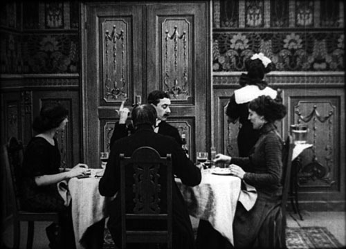
Augustinus comes up with a virtuoso solution in a dinner scene of Hard-Won
Honor (Dyrekobt Aere, 1911). A doctor and his young wife are dining
at the home of a cold-hearted seducer and his wife. The doctor is turned from
us, directly across from the seducer, who reveals himself only when he moves
his head. 5 William
Augustinus comes up with a virtuoso solution in a dinner scene of Hard-Won
Honor (Dyrekobt Aere, 1911). A doctor and his young wife are dining
at the home of a cold-hearted seducer and his wife. The doctor is turned from
us, directly across from the seducer, who reveals himself only when he moves
his head.
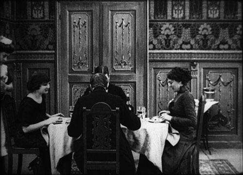

The couples chat, with each man leaning toward the other’s spouse.
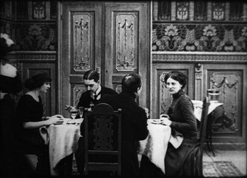
Augustinus finds a wonderful way to suggest that a telephone
has rung. Everyone pauses, and then the householder’s hand comes up into the frame, waggling
to instruct the maid to go answer it.
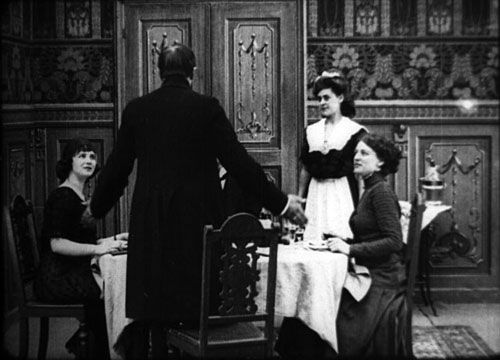
The maid returns to tell the doctor he’s wanted and he rises, shrugging
as if to say, “What can I do?” This gives the actor a chance to act
with his whole body, a common feature of 1910s European cinema.

As the doctor leaves, the lothario continues to press his
attentions on the man’s
wife.
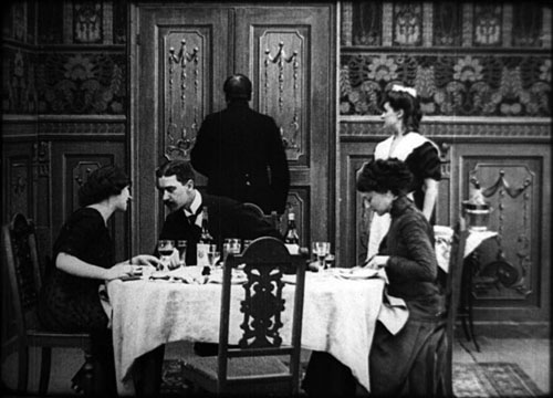
In just a few years, the sort of casual camera-hogging
we find in Pat Corner has
become shaped and carefully timed to bend the scene in a dramatic arc.
Through the Looking-Glass
In the richly
composed imagery of European 1910s cinema, mirrors take on great value, and Danish
filmmakers were among the first to exploit them. 6 In
August Blom’s White Slave Trade I of 1910, a centrally placed
mirror, tipped downward to avoid showing the camera, is merely an item of parlor
furniture, adding a touch of verisimilitude. Only a year later, Blom gave a mirror
a starring role, employing it to increase a scene’s dramatic and pictorial
power. In The
Ballet Dancer, Camilla, portrayed by Asta Nielsen, is about to perform for
a society soirée. The hostess Yvette passes among her guests, her reflection
caught in the angled mirror. 6 In
August Blom’s White Slave Trade I of 1910, a centrally placed
mirror, tipped downward to avoid showing the camera, is merely an item of parlor
furniture, adding a touch of verisimilitude. Only a year later, Blom gave a mirror
a starring role, employing it to increase a scene’s dramatic and pictorial
power. In The
Ballet Dancer, Camilla, portrayed by Asta Nielsen, is about to perform for
a society soirée. The hostess Yvette passes among her guests, her reflection
caught in the angled mirror.
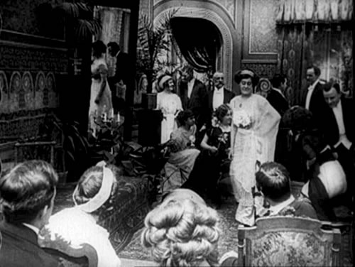
Suspense is created as Camilla takes the dais and in a centrally placed mirror
we can see the hostess and her lover already starting to flirt.
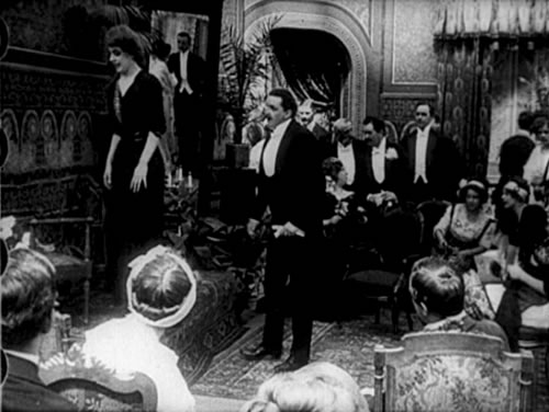
As she’s about to sing, she discovers her lover and
the party hostess sharing a kiss off frame right.
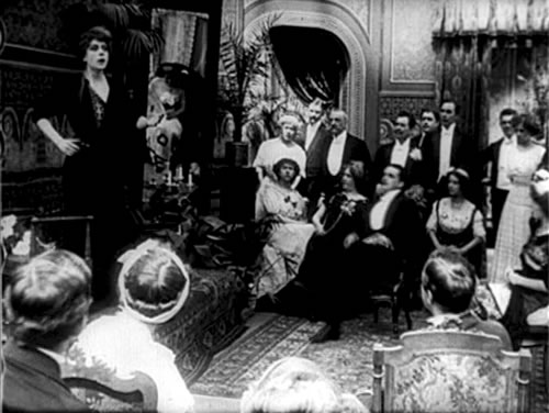
She cries out and points to the couple, causing them to start guiltily.
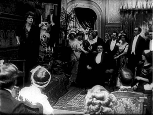
In a remarkable touch, her extended finger points directly
at their reflection, guiding our eye decisively.
Any mirror
folds the geometry of the optical pyramid into the shot, acknowledging the specifically
cinematic playing space we’re viewing. In proscenium theatre, a precisely
framed reflection of the lovers wouldn’t be visible to every member of
the audience, since each spectator sees a different aspect of the stage ensemble.
A mirror angled in this fashion might reflect the wings or other theatregoers.
In film, however, an onscreen mirror helps pack information into the single frame.
Capturing a reflection parallels the effect of showing something in the background
through a window or door. 7 In
our Ballet Dancer scene, the gigantic mirror resembles another massive
frame, the doorway dividing the room. And just as distant action can be concealed
or exposed by foreground activity, as in our example from The Clown,
the mirror reflection can undergo transformations in the course of a scene. 7 In
our Ballet Dancer scene, the gigantic mirror resembles another massive
frame, the doorway dividing the room. And just as distant action can be concealed
or exposed by foreground activity, as in our example from The Clown,
the mirror reflection can undergo transformations in the course of a scene.
The
embedded mirror, though presenting production problems, offers several advantages
for staging the drama. It can increase suspense, as when in this scene the spectator
is likely to discover the action slightly before Camilla does. A mirror also
allows every element to be frontally positioned. Imagine an alternative setup
for the soirée scene, minus the mirror. Blom could have placed Camilla
in the foreground and the wayward couple in the distance. In order to see them,
Camilla would have to turn from us, but this move would conceal her reaction.
She would then have to turn back to us, perhaps unnaturally, to display her outrage.
The mirror permits us to view her fully and continually, so her realization can
dawn completely for us, while also presenting an unbroken image of the lovers’
brazen flirtation.
We have time
as well to register the husband’s sudden awareness of his wife’s
infidelity, since he sits at frame center and reacts when Camilla points accusingly.
His reaction is highlighted further by the fact that the spectators in the immediate
foreground don’t turn their heads to follow Camilla’s finger. Had
they done so, their movement might well have distracted us from his response,
so keeping them unnaturally fixed guides our attention to the crucial action
elsewhere. (You could also argue that, because they’re positioned as an
extension of our own position in the audience, at least some of them might be
able to see the reflection as we do.)
Jonathan Miller
points out that in painting, a mirror needs to be signaled as a surface through
streaks, highlights, and texture features, so that it isn’t mistaken for
a window. 8 In
the fairly distant shots of 1910s cinema, such signals aren’t easy to send,
although brightening the reflection can help a little. Most commonly, the mirror
is “primed” in
our perception by being introduced in a prosaic way before the spectacular effects
are launched. In the Ballet Dancer scene, the mirror is established
when the hostess strides past her guests and we see her reflected in it. Once
primed, the mirror can become both a surface and a view of space. At the climax,
underscoring the action in the mirror, Camilla’s gesture of pointing offscreen
is framed within the reflection, her finger virtually jabbing her cheating lover’s
belly. 8 In
the fairly distant shots of 1910s cinema, such signals aren’t easy to send,
although brightening the reflection can help a little. Most commonly, the mirror
is “primed” in
our perception by being introduced in a prosaic way before the spectacular effects
are launched. In the Ballet Dancer scene, the mirror is established
when the hostess strides past her guests and we see her reflected in it. Once
primed, the mirror can become both a surface and a view of space. At the climax,
underscoring the action in the mirror, Camilla’s gesture of pointing offscreen
is framed within the reflection, her finger virtually jabbing her cheating lover’s
belly.
Comparable
priming, along with some tricky angling, can be found in Under the Lighthouse
Beam (Under Blinkfyrets Straaler, 1913). Here Robert Dinesen has his mourning
mother and son enter a parlor, with the mirror carefully angled to show the son’s
approach.

Hugo walks straight into the parlor, fully reflected in
the mirror, but coming onscreen he appears following his mother along a diagonal.
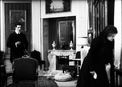
The two sit silently in mourning before a maid enters the
room. They turn to look at her off left as she shuts the door.
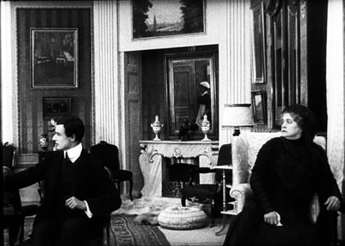
She is bringing a letter from Robert, the other brother.
Hugo is made upset by Robert’s message and leaves the shot. But he pauses at the doorway.
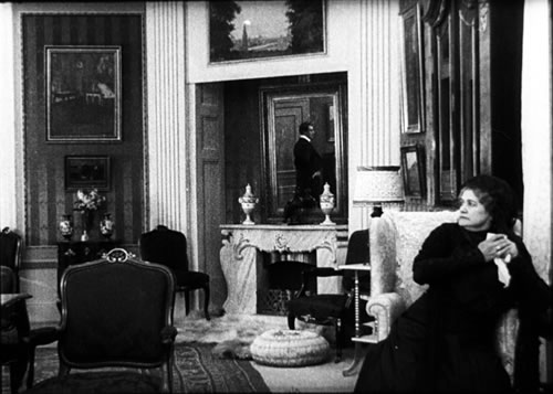
He seems to be looking at his mother, in a straight left-right exchange. But
if he were actually looking straight into the room, his reflection would be frontal
and facing us, as it was when he came in. I suspect that Dinesen instructed the
actor to look off at an angle, not at the actress, so that the image would be
legible to us as an exchange of glances.
Often, then,
the mirror is introduced innocuously but then exploited for more vivid effects.
The need to prime the mirror can create themes and variations across the whole
film. In Temptations of a Great City (Ved Fængslets Port,
1911), Blom establishes a mirror in the parlor by having several servants and
occupants pass through and create reflections.

At one moment, when Aage’s mother discovers one of his bad debts, Blom
makes dramatic use of the mirror to portray her anxious disappointment and his
casual evasiveness.
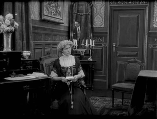
The characters’ positions are reversed at the celebrated climax. Aage sneaks
in to steal money, but he decides not to take it. His agony of decision is witnessed
by his mother, whose relief we see reflected in the mirror.
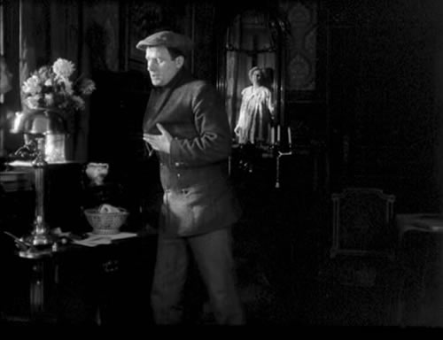
After this
extraordinary image, the drama is ratcheted up by a flash of mirror-driven choreography.
A shadowy figure enters, blocking the mother’s reflection and startling both
Aage and us. It is the reflection of the back of concierge, whom we’ve
seen calling a policeman earlier.

The lights are flicked on, and now the blob that had arrested
our eye is replaced by the body of the policeman, standing at frame center and
again masking the mother’s reflection.
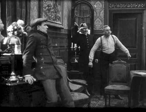
The two men stare offscreen, at the mother whose reaction
is now unavailable to us. Will she turn her son in or cover for him as in the
past?
In Temptations
of a Great City, the mirror becomes a motif associated with the son’s
irresponsibility and the mother’s loving patience. The general capacity
of cinematic staging to block and reveal figures in depth has been multiplied
by the mirror’s ability
to expose and expunge reflections in ways that heighten the scene’s dramatic
rhythm.
Two 1915 Instances
Needless to
say, most of the nearly 900 Nordisk films produced in the 1910s probably weren’t
as pictorially daring and dramatically engaging as the instances I’ve examined.
Even some official classics, like Atlantis (1913), are notably short
on these virtuoso moments. Nor did the studio’s talent work at a consistently
high level. Nonetheless, Blom, along with Gad, Sandberg, Hjalmar Davidsen, Robert
Dinesen, Forest Holger-Madsen, and Edward Schnedler-Sørensen took the
tableau style in exciting directions. Without suggesting anything like steady
progress toward consummate excellence, I want to point to two films of 1915 that
exemplify the sort of dynamic staging that the Nordisk contract directors could
achieve.
Holger-Madsen’s The
Candle and the Moth (Evangeliemandens Liv) provides an extraordinary
display of the possibilities of ensemble staging. Almost any scene could be studied
closely for its finesse in playing out the dramatic issues through the actors’
movements in space. Staging motifs recur, as when the early encounter of the
hero John Redmond with the teasing society woman confront his rival around a
curtain.
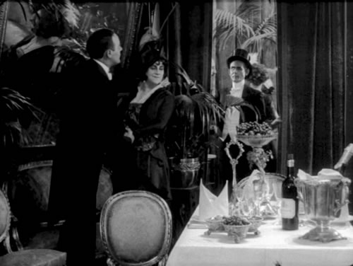
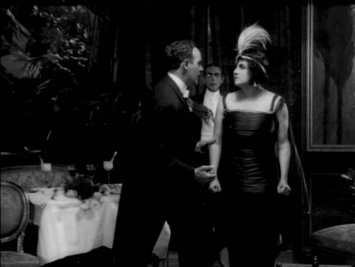
This string of events is amplified in the same setting
later; the rival, cast out again, intervenes and triggers the woman’s death.
The film’s most emotionally compelling scene takes place in the Green Parrot
pub, in which Preacher John tries to convert Billy and protect Billy’s
girlfriend Nelly. The scene displays all the resources of 1910s depth staging—the
advance to the foreground, actor frontality, apertures, and the dynamics of centering
and recentering, blocking and revealing. Early in the scene, Nelly appears at
the pub window as the gangleader starts bullying her boyfriend.
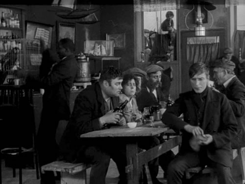
Nelly has tried to make Billy leave, but the bully has
set her down at the table in the background. Now John the preacher offers Billy
a pamphlet.
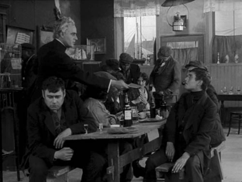
The centrality of the gesture underscores its importance
and links it to Nelly, also centered in the more distant plane, tormented by
gang members.
John has confronted
the bully and rescued Nelly. Now his withering glance at the despondent Billy
reminds the boy that he has failed to protect the woman he loves.
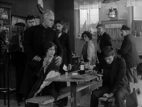
Holger-Madsen has delicately shifted our concern from Nelly
to John to Billy. At the scene’s end, after John has escorted Nelly out, we see the weak
Billy trapped into crime by the gang boss.
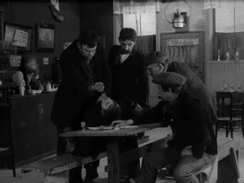
Over seven minutes, the single setup is interrupted only
by titles, an insert, and two cutaways to the street outside. The scene shows
how the 1910s style can achieve, by quietly virtuoso means, great fluidity of
emphasis.
The Candle
and the Moth is an acknowledged classic, while Doktor Voluntas (aka Dr. X)
is a fairly obscure melodrama. Its presentation of a master puppeteer guiding
the lives of innocents, as Ron Mottram has pointed out, looks forward to German
Expressionism. 9 Just
as striking, however, is Robert Dinesen’s bold use of composition and staging.
Felix, an introverted researcher, asks the worldly Dr. Voluntas to guide him
toward worldly pleasures. Dr. Voluntas accepts the invitation and leads his laboratory
rival down the path of dissipation. 9 Just
as striking, however, is Robert Dinesen’s bold use of composition and staging.
Felix, an introverted researcher, asks the worldly Dr. Voluntas to guide him
toward worldly pleasures. Dr. Voluntas accepts the invitation and leads his laboratory
rival down the path of dissipation.
One striking
motif is that of a sweeping darkness associated with Voluntas’ control
over Felix. Early on, both men become shadowy figures coming out of the foreground
when Voluntas takes Felix to a jewelry shop.
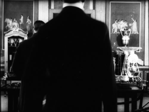
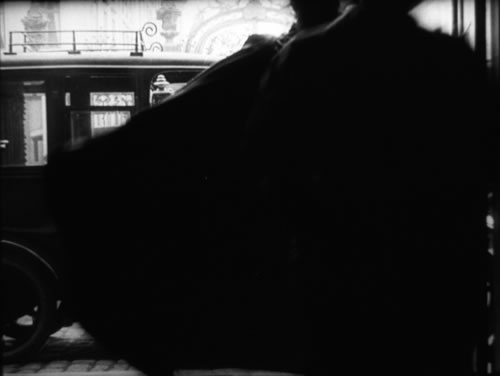
More flagrantly, after Felix has killed a man in a duel
and been imprisoned, Voluntas celebrates his release with a costume ball. The
two men arrive in a carriage and Voluntas, dressed as Satan, strides into the
foreground, his cloak billowing over the camera and enveloping Felix.
The motif
culminates in a striking scene. Above the ballroom is a private box, and Felix
and a soubrette enter it.

Soon Voluntas arrives and as Felix and the woman embrace
on the couch, he blesses their embrace with a diabolical sweep of his cloak.
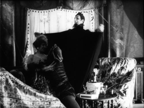
Then, remarkably, Voluntas turns his back on us and becomes
a batlike silhouette looming over the box, conducting the orchestra as if he
were master of the revels.
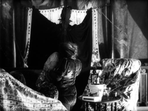
The couple separate, with Felix moving to the opposite
couch. As he looks up, he sees the figure of Margaret, the woman he has loved
and abandoned, hovering on Voluntas’ cloak.
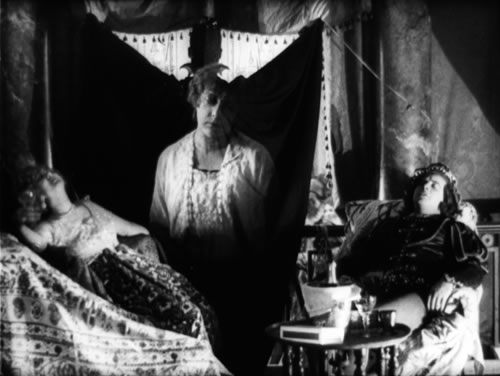
He rises in horror and confronts Voluntas; at last he realizes
his mentor’s
demonic designs.
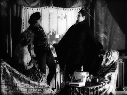
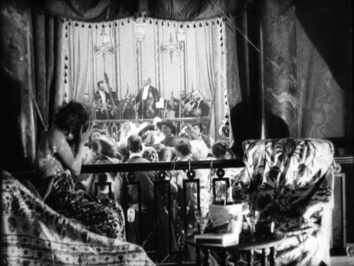
Felix flees over the railing, leaping to the dance floor
below.
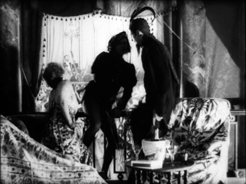
Felix runs through the distant crowd. Voluntas obligingly
moves aside a little to allow us to watch his escape.
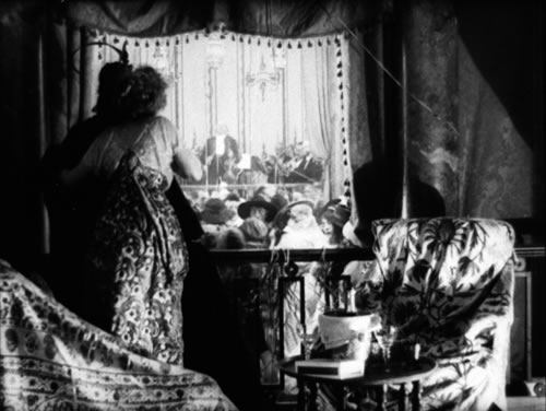
The two-minute shot, unbroken by cuts or titles, shifts
from stark depth (the box and the ballroom beyond) to shallow staging among the
principals, and then to a geometric abstraction as Voluntas’ power over the revels is expressed
by sheer graphic shape. Felix confronts Voluntas on one plane, which immediately
yields to very deep space as he flees into the distance.
The scene ends with a return to the primary plane. Voluntas bends over the woman,
as if to kiss her, with the cloak again linking Voluntas to her.
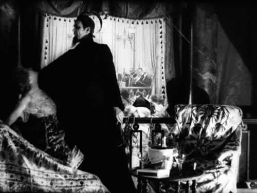
Abruptly he withdraws and bursts into laughter, completing
his role as Satanic tempter.
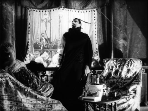
He exits, leaving the soubrette sobbing and the crowd behind absorbed in their
dance.
The expressive power of the scene is presented wholly through
a fluid choreography of figures, punctuated by a burst of abstraction as Voluntas’ cape
becomes both a visceral emblem of his power and the backdrop for an image of
the woman whom Felix has lost.
This sequence
reminds us that Nordisk directors had a taste for geometric abstraction that
merits study in its own right. In Blom’s Atlantis (1913), sending
a telegram becomes an exercise in compositional austerity.

In The Candle and the Moth, prisoners kept in solitary confinement form
geometrical ranks in the chapel.
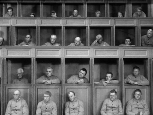
My main point, though, is to show the level of achievement—one attained,
remarkably, within only a few years. Progress is always a contentious notion
in the arts, but when several artists share norms, purposes, and circumstance
(here, a common studio culture), we can sometimes identify a growing mastery
of technique. From the awkwardness of the office boy in Pat Corner in
1909 we can identify a growing confidence in choreography (depth, blockage, mirrors)
that leads to the sustained intricacy of the pub scene in The Moth and the
Flame and the bravura vivacity of Dr. Voluntas. In at least
some films, the Nordisk directors display a progressive refinement of basic staging
principles.
Not Exactly America
Even while
Nordisk filmmakers were enriching the single shot, they were exploring the possibilities
of the alternative tradition, that continuity-editing approach that was beginning
to dominate the other side of the Atlantic. In The
Danish Cinema Before Dreyer,
Ron Mottram has carefully traced Danish directors’ assimilation of crosscutting,
scene dissection, and other techniques. Yet it seems that most Nordisk directors,
perhaps because they began working before the rise of classical continuity, didn’t
wholeheartedly embrace the new style. Their approach, at least in dramas, seems
to have remained rooted in the tableau. 10 10
Testimony
on this point is offered by Urban Gad, who after he moved to Germany wrote a
1919 book on film direction (presumably the first production manual by a major
director). Gad recommends recording a scene entirely in long shot, then replaying
part of it for a closer view. 11 This
tableau-plus-insert approach is found throughout Europe in the teens, and it
is one American technique as well, although Hollywood filmmakers were also building
scenes out of many close shots. 11 This
tableau-plus-insert approach is found throughout Europe in the teens, and it
is one American technique as well, although Hollywood filmmakers were also building
scenes out of many close shots. 12 Gad
explicitly declares that one should not “cut a scene into small bits,” in
which “faces appear on the screen only a second and vanish into something
else.” 12 Gad
explicitly declares that one should not “cut a scene into small bits,” in
which “faces appear on the screen only a second and vanish into something
else.” 13 In
the period 1917-1920, many US films averaged between five and seven seconds per
shot, with some, such as the Doug Fairbanks comedy Reaching for the Moon (1917)
hitting an astonishing three-second average. 13 In
the period 1917-1920, many US films averaged between five and seven seconds per
shot, with some, such as the Doug Fairbanks comedy Reaching for the Moon (1917)
hitting an astonishing three-second average.
Some European
filmmakers compromised more with the new methods than Gad recommended. A fascinating
hybrid can be seen in Holger-Madsen’s Towards the Light (Mod
Lyset,
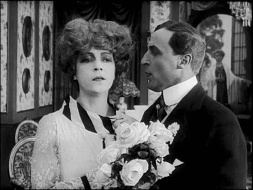
1919). We find, alongside scenes built upon depth staging, a fair amount of analytical
scene breakdown using axial cut-ins. Consider the tableau shot in which Sandro
presses his attention on Ysabel. A cut-in medium shot not only dwells on the
characters’ reactions but preserves depth by showing the countess watching
from the right background.
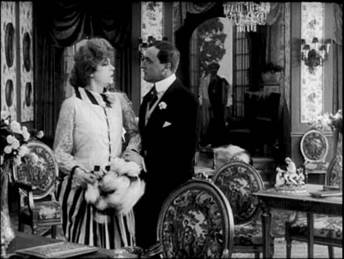
The acceptance of analytical editing is signaled as well by uses of a mirror
that we would find far more typical today. Here Ysabel is haunted by the warning
of Professor Manini, who appears in her bedroom mirror.
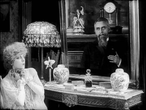
The average shot in Towards the Light lasts about
8 seconds, long by Hollywood standards of the day but much briefer than the Danish
norms in force a few years before. (In our 1915 examples, The Candle and
the Moth averages
thirty seconds per shot, Doktor Voluntas 25.6 seconds.)
More distinctly “American” are
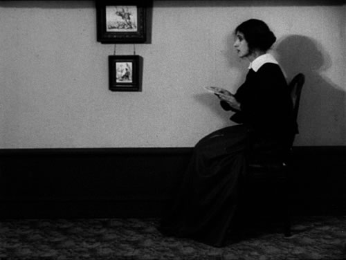
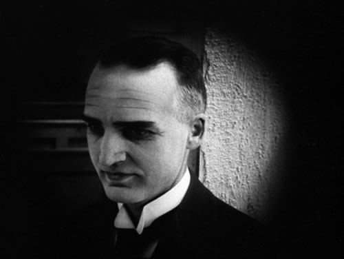
the first two features by Dreyer, made during Nordisk’s declining years. The
President (1920) has an average shot length of 8.8 seconds, comparable to
that of Toward the Light, but it avoids depth staging to a remarkable
extent. Its rather spare tableaux incline toward the purely abstract, its editing
is rather abrupt, and its close-ups are quite tight in the American manner.
Leaves from Satan’s Book (1921) goes further
in this direction. Composed of over a thousand shots, it has an average shot
length of 5.9 seconds, and in the final episode, hell-for-leather crosscutting
yields an average of 4.9 seconds. Dreyer became for the duration of the silent
cinema an editing-oriented director. The results included The Master of the
House (1925), based
heavily upon single shots of actors and close-ups of faces, hands, and props,
and the overwhelming montage of La Passion de Jeanne d’Arc (1928). 14 Like
many other young directors who began their career in the mid- and late teens
(Ford, DeMille, Walsh, Gance, Lang, Lubitsch, Murnau, Kuleshov), Dreyer was quick
to pick up on the new style. Only at the end of his career did he seem to reconsider
1910s tableau strategies; Gertrud (1964) in particular might be considered
a self-consciously anachronistic reworking of a tradition that the young director
had once repudiated. 14 Like
many other young directors who began their career in the mid- and late teens
(Ford, DeMille, Walsh, Gance, Lang, Lubitsch, Murnau, Kuleshov), Dreyer was quick
to pick up on the new style. Only at the end of his career did he seem to reconsider
1910s tableau strategies; Gertrud (1964) in particular might be considered
a self-consciously anachronistic reworking of a tradition that the young director
had once repudiated. 15 15
Yet the tableau
format didn’t entirely die out. The choreographic techniques it fostered
persisted in milder form through the silent era and the mature sound cinema. 16 In
any case, it is clear that Nordisk and its creative directors made superb contributions
to film art in an era that, in remarkably short order, laid the foundations of
cinematic storytelling as we still know it. 16 In
any case, it is clear that Nordisk and its creative directors made superb contributions
to film art in an era that, in remarkably short order, laid the foundations of
cinematic storytelling as we still know it.
Notes
This is a revised and expanded version of an essay
of the same title published in 100
Years of Nordisk Film, ed. Lisbeth
Richter Larsen and Dan Nissen (Copenhagen: Danish Film Institute, 2006), 80–95.
The generous cooperation of Thomas Christensen, Mikael Brae, Dan Nissen, and
Lisbeth Richter Larsen enabled me to enhance the first version.
1 : 100 Years
of Nordisk Film, ed. Lisbeth Richter Larsen and Dan Nissen (Copenhagen:
Danish Film Institute, 2006).
2 :
For English-language readers, the indispensable reference on this period is Ron
Mottram, The
Danish Cinema Before Dreyer (Metuchen, NJ: Scarecrow, 1988). See as well
the lively and illuminating study by Casper Tybjerg, An Art of Silence and
Light: The Development of the Danish Film Drama to 1920 (Copenhagen: Ph.
D. dissertation, University of Copenhagen, 1996). Older but still useful sources
are Ebbe Neergaard, The
Story of Danish Film (Copenhagen: The Danish Institute, 1963) and Bebe Bergsten, The
Great Dane and the Great Northern Film Company (Los Angeles: Locare Research
Group, 1973). In Danish, the most magisterial sources are by Marguerite Engberg.
See her catalogue, Den Danske Stumfilm 1903–1930 (Copenhagen: Danish
Film Museum, 1968) and her two-volume study Dansk
Stumfilm: De Store År (Copenhagen:
Rhodos, 1977). See also essays in Schiave bianche allo specchio: Le origini del cinema
in Scandinavia (1896–1918), ed. Paolo Cherchi Usai (Pordenone:
Studio Tesi, 1986).
3 : See
Charles Barr, “CinemaScope: Before and After,” Film Quarterly 16,
4 (Summer 1963): 18–19.
4 :
See Ebbe Neergaard, The Story of Danish Film, 26. On US practice, see
Barry Salt, Film
Style and Technology: History and Analysis, 2d ed. (London: Starword, 1992),
87–91; and Kristin Thompson, “The Formulation of the Classical Narrative,” in
David Bordwell, Janet Staiger, and Kristin Thompson, The Classical Hollywood
Cinema: Film Style and Mode of Production to 1960 (New York: Columbia University
Press, 1985), 190.
5 : I
discuss this as a recurring problem in film staging in my Figures Traced in Light:
On Cinematic Staging (Berkeley: University of California Press, 2006), 1–10,
19–22.
6 :
Several historians have noted this tendency. See Mottram, Danish Cinema Before
Dreyer,
85, 87, 146, 178; Barry Salt, “Schiave Bianche e Tende a Strisce: La Ricerca
del ’Sensazionale,’” in Usai, Schiave bianche, 70–73;
Tybjerg, Art
of Silence and Light, 169-172. On mirrors in 1910s films elsewhere, see
Yuri Tsivian, “Portraits, Mirrors, Death: On Some Decadent Clichés
in Early Russian Film,” Iris no. 14–15 (Autumn 1992): 75–77.
7 : Ben Brewster and
Lea Jacobs analyze the effect achieved by a central mirror at a climactic moment
of The Clown. See Theatre to Cinema: Stage Pictorialism and the
Early Feature Film (Oxford: Oxford University Press, 1997), 177–179.
8 : Jonathan Miller, On
Reflection (London: The National Gallery, 1998), 72–90.
9 : Mottram, Danish
Cinema Before Dreyer, 220.
10 : I hedge
this claim because Lau Lauritzen, Nordisk’s in-house comedy director, seems
to have quickly assimilated the emerging American style. His two-reel Don
Juan’s
Superior (Don Juans Overmand, 1916) contains many tight two-shots
and eyeline matches, yielding a visual texture quite different from that of the
more prestigious features produced at the studio at the time. Lauritzen seems
definitely to be a director worth investigating on this front. I’m grateful
to Thomas Christensen for screening Don Juan’s Superior at the June seminar
mentioned above.
11 :
Urban Gad, Filmen:
Dens Midler og Maal (Copenhagen: Gyldendal, 1919), 129.
12 : I
discuss this tendency in Figures Traced in Light: On Cinematic Staging (Berkeley:
University of California Press, 2005), 66–73.
13 :
Gad, Filmen,
128.
14 :
On Master
of the House, see Casper Tybjerg, “Honor Thy Craft: Questions of Style
in Dreyer’s Master of the House,” Aura 6, no. 2
(2000), 58–71. By Tybjerg’s reckoning, the film averages 4.7 seconds per
shot, suggesting that Ebbe Neergaard may have been right to consider Master the
fastest-cut Danish silent film (p. 67). See also Edvin Kau, Dreyers Filmkunst (Copenhagen:
Akademisk Forlag, 1989), 107–126. On editing in La Passion de Jeanne d’Arc,
see David Bordwell, The Films of Carl-Theodor Dreyer (Berkeley: University
of California Press, 1981), 66–92 and Kau, Dreyers Filmkunst, 141–198.
15 :
For more on this point, see my essay “The
Dreyer Generation” and my
blog entry.
16 :
See my On
the History of Film Style (Cambridge: Harvard University Press, 1997), 163–221.
|


