Figures Traced in Light: On Cinematic
Staging
[1] Introduction
[2] Revising Our Sense
of Feuillade
[3] Mizoguchi the Inexhaustible
[4] Cheerful Staging: Hou’s
Early Films
[5] Staging and Stylistics:
Some Further Business
[6] Misprints, Mistakes, and Missed
Opportunities
Cheerful Staging: Hou’s Early Films
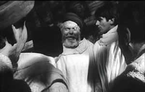
Fig. 5A.1
Chimes at Midnight (1966)Around the world, from the late 1930s through the 1960s, many
films relied on wide-angle lenses—those short focal-length lenses
that allowed filmmakers to stage action in vivid depth. One
figure or object might be quite close to the camera, while
another could be placed much further in the recesses of the shot.
The wide-angle lens allowed filmmakers to keep several planes in
more or less sharp focus throughout, and this led to compact,
sharply diagonal compositions (Fig. 5A.1, right). Although Citizen Kane (1941) probably drew the most attention to this
technique, it was occasionally used in several 1920s and 1930s
films made throughout the world. (I sketch a history of this
technique in the last chapter of On the History of Film
Style.) The great French critic André Bazin was the most
eloquent analyst of the wide-angle aesthetic, and his discussion
of Citizen Kane, The Magnificent Ambersons (1942), The Little Foxes (1941), and The Best Years of Our Lives (1946) has strongly shaped our understanding of this
technique.
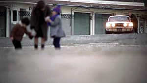
Fig. 5A.2
A Man and a Woman (1966)The 1960s saw the development of an opposite approach, what we
might call the telephoto aesthetic. Improvements in long
focal-length lenses, encouraged by the growing use of location
shooting, led to a very different sort of imagery. Instead of
exaggerating the distances between foreground and background,
long lenses tend to reduce them, making figures quite far apart
seem close in size. (In shooting a baseball game for television,
the telephoto lens positioned behind the catcher presents
catcher, batter, and pitcher as oddly close to one another.)
Planes seem to be stacked or pushed together in a way that seems
to make the space “flatter,” the objects and figures
more like cardboard cutouts. The style was popularized by films
like A Man and a Woman (1966; Fig. 5A.2, right) and Elvira
Madigan (1967), in which the soft haze yielded the long lens
added a degree of romanticism. The telephoto look quickly spread,
employed by directors as diverse as Sam Peckinpah and Robert
Altman, whose 1970s films also use the long lens, controlled by
zooming, to squeeze a crowd of characters (M*A*S*H, 1972; Nashville, 1975) into the fresco of the anamorphic
frame.
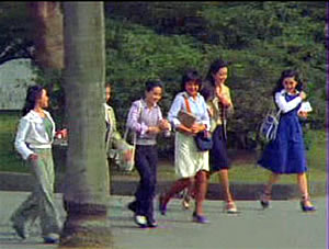
Fig. 5A.3
Diary of Didi (1978). Cropped image from anamorphic widescreen. |
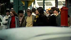
Fig. 5A.4
Love Story (1970)
|
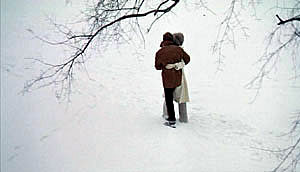
Fig. 5A.5
Love Story
|
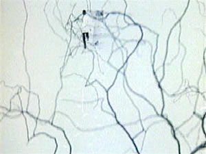
Fig. 5A.6
Love Love Love (1974). Cropped image from
anamorphic widescreen. |
Hou Hsiao‑hsien came to filmmaking via the romance films so
common in Taiwan in the 1970s, and this genre employed the long
lens extensively. Working with low budgets, filmmakers relied on
location shooting. The telephoto allowed the camera to be set far
off and to cover characters in conversation for fairly lengthy
shots (Fig. 5A.3). In this respect, the directors were not so far
from their Hollywood contemporaries; Love Story (1970)
employs these techniques on a bigger budget (Fig. 5A.4). Indeed, Love Story (a big hit in Taiwan) may have pushed local
filmmakers toward using this technique in their own romantic
melodramas; sometime the influence seems quite direct (Figs. 5A.5 and 5A.6).
Chapter 5 of Figures Traced in Light argues
that Hou’s early romance-musicals led him to principles of
staging which became refined in his later work. These principles
were developed almost completely, I believe, in the context of
the telephoto aesthetic. Hou’s inclination toward location
shooting and the use of nonactors, along with his attention to
the concrete details of everyday life, allowed him to see the
power of a technique that put character and context, action and
milieu on the same plane. His crowded compositions are organized
with great finesse in order to highlight, successively, small
aspects of behavior or setting, and these enrich the unfolding
story, as I try to show in his masterpieces of the 1980s and
1990s. Using a long lens (usually 75mm–150mm) he began to exploit
some “just-noticeable differences” that the lens
produces as byproducts. Unlike most of his contemporaries,
Eastern or Western, he saw the pictorial and dramatic
possibilities of the telephoto lens, and they became central to
his distinctive way of handling scenes. A purely technological
innovation yielded artistic prospects which he could explore in
nuanced ways.
We can watch this process unfolding in what many consider
Hou’s most disposable movies, the boy-meets-girl romances Cute Girl (1981) and Cheerful Wind (1982) and
the pastorale The Green Green Grass of Home (1983).
These charming films show him developing, in almost casual ways,
techniques of staging and shooting that will become his artistic
hallmarks. Chapter 5 provides the detailed argument, but let me
highlight three points here.
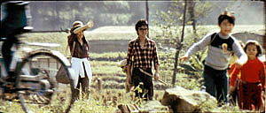
Fig. 5A.7
Cheerful Wind (1982)
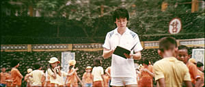
Fig. 5A.8
The Green, Green Grass of Home (1983).
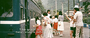
Fig. 5A.9
The Green, Green Grass of Home.One byproduct of the long lens is a shallow
focus, as we can see in the examples above. Because the
lens has little depth of field, one step forward or backward can
carry a character out of focus. Savoring the effects of gently
graded focus is a common feature of Hou’s later work. The
masher at the train station in Dust in the Wind (1987)
moves eerily in and out of focus in the distance. In Daughter
of the Nile (1988), there’s an amazing shot showing
gangsters approaching a victim’s SUV outside a nightclub: at
first they’re only barely discernible blobs (seen through the
vehicle’s narrow windows) but then they gradually come into
ominously sharp focus in the foreground, preparing to attack one
of the boys inside. The slight focus changes train us to watch
tiny compositional elements for what they may contribute to the
drama. Hou’s three first films don’t use the option quite
so daringly; here the degrees of focus concentrate on the
principal players but still allow us to register the teeming life
around them (Figs. 5A.7 and 5A.8). Hou can even put different
dramatic situations on different layers. In The Green Green
Grass of Home, the departure of the little girl,
saying farewell to her host family, plays out slightly closer to
the camera than the departure of the eccentric teacher (Fig. 5A.9). This principle operates just as well in the wonderfully distracting street and train-platform scenes of Café Lumiere (2004), in many ways Hou’s sophisticated return to shooting techniques used in his 1980s films.
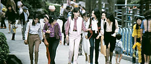
Fig. 5A.10
Cute Girl (1981). |
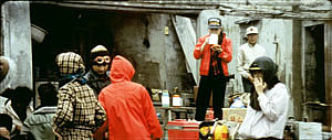
Fig. 5A.11
Cheerful Wind. |
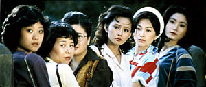
Fig. 5A.12
Cute Girl. |
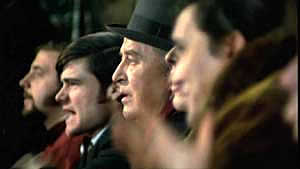
Fig. 5A.13
Love Story. |
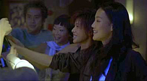
Fig. 5A.14
Millennium Mambo (2000). |
|
Secondly, the long lens yields a flatter-looking
space. It has depth, but the cues for depth that it
employs are things like focus, placement in the picture format
(higher tends to be further away), and what psychologists call
“familiar size”—our knowledge that, say, children are
smaller than adults, even if the image makes them both of equal
size. One favorite Hou image schema is the characters stretched
in rows perpendicular to the camera, and the telephoto lens, by
compressing space, creates this “clothesline” look more
vividly. We can find the clothesline composition in many early
films (Figs. 5A.10 and 5A.11). Another favorite schema is the
“stacking” of several faces lined up along a diagonal
(Fig. 5A.12). Interestingly, this can be seen as a refinement of
a schema that was in wider use, as an example from Love Story indicates (Fig. 5A.13). But Hou uses this sort of
image more subtly. The telephoto lens lets him stack faces in
ways that encourage us to catch a cascade of slight differences
(Fig. 5A.14 [from Millennium Mambo (2000)]). In the
table scenes of Flowers of Shanghai (1998) this
principle is carried to a degree of exquisite refinement without
parallel in any other cinema I know.
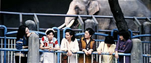
Fig. 5A.15
Cute Girl. |
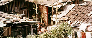
Fig. 5A.16
The Green Green Grass of Home. |
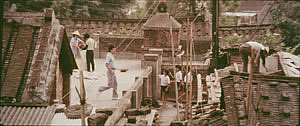
Fig. 5A.17
The Green Green Grass of Home. |
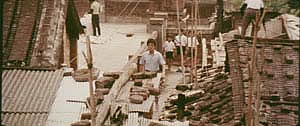
Fig. 5A.18
The Green Green Grass of Home. |
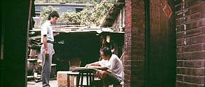
Fig. 5A.19
The Green Green Grass of Home. |
|
In general, because Hou is committed to a great density of
information in the shot, the compression yielded by the long lens
tends to equalize everything we see. Minor characters, or just
passing strangers, become slightly more prominent, while details
of environment can get pushed forward as well. The zoo scenes of Cute Girl enjoy showing us our characters in relation to
the creatures around them (Fig. 5A.15), and the tile rooftops
of The Green Green Grass of Home, secured by
bricks and pails and tires, become just as important as the
father and son crouching below (Fig. 5A.16). In the latter film,
Hou develops the equalized-environment option in quite a precise
way in one particular scene. A long-lens distant view catches the
teacher coming to the father’s house along a corridor of
rooftops (Figs. 5A.17 and 5A.18). When the teacher confronts the
father, instead of tight framings on each man, Hou cuts to
another angle that activates yet another range of environmental
elements—principally the train passing in the background,
prefiguring the trip that the man’s son and daughter will
take in an effort to find their mother (Fig. 5A.19).
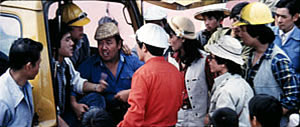
Fig. 5A.20
Cute Girl. |
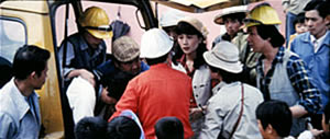
Fig. 5A.21
Cute Girl. |
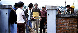
Fig. 5A.22
Cute Girl. |
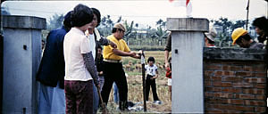
Fig. 5A.23
Cute Girl. |
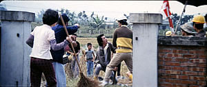
Fig. 5A.24
Cute Girl. |
|
Because the long lens has a very narrow angle of view (the
opposite of a “wide-angle” lens; see Figures,
p. 197), it affects the image in a third major way. If you use a
long lens in a space containing several moving figures, people
passing in the foreground will block the main figures: they pass
between the camera and the lens. Hou elevates this blocking-and-revealing tendency to a level of
high art. Throughout Figures Traced in Light, I argue
that many great directors, from the silent era forward, have
staged action in the shot so as to block and reveal key pieces of
information, calling items to our attention at just the right
moment with unobtrusive changes of figure position. The
possibility of blocking and revealing arises from the
“optical pyramid” created by any camera lens. (See the
discussion on pp. 62–63.) What I’m suggesting is that using
the telephoto lens on location probably made Hou exceptionally
sensitive to the resources of masking and unmasking bits of the
shot. So we get not only passersby drifting through the
foreground (Fig. 5A.7 above) but also quite refined use of slight
character movement to attract our attention in the course of the
scene. The loveliest example I know in the early films is the Cute Girl shot analyzed in Figs. 5.23 to 5.28 on page 200
of Figures, when Fei‑Fei confronts the surveyors and the
man in the red shirt serves as a pivot for our attention (e.g.,
Figs. 5A.20 and 5A.21). A less drastic example occurs when the
surveying team starts quarrelling with the locals around a walled
gate: The team’s blocking of the gate (Fig. 5A.22) gives way
to movement into depth (Fig. 5A.23) and a struggle there between
them and the townsfolk (Fig. 5A.24).
In all, it seems to me that these three resources of the long
lens—the shallow focus, the compressed space, and the narrow
angle of view—supplied bases for Hou’s shooting and staging
in the later films. This is not to ignore his use of the
wide-angle lens on occasion, particularly interiors. Once the
lessons of the long lens had been absorbed, he could apply the
staging principles that he’d developed to other kinds of
shots and story situations. Nor am I claiming that other
directors hadn’t also explored some of these options. Years
before Hou, Kurosawa and other Japanese directors used the long
lens to create very abstract compositions (Figures, p. 201). Still, the Japanese directors tend to use the lens more
flamboyantly than Hou does. His style is fairly unemphatic. (One
indication of Hou’s skill in keeping our attention on his
unfolding story is that as far as I know, no other critics have
noticed the staging strategies I’ve pointed out here and in Figures.)
Overall, I think that Hou saw certain pictorial possibilities
in the long lens, and after developing them to a certain point in
popular musicals, he recast them when he took up another kind of
storytelling. He realized that leisurely, contemplative
narratives permitted him to refine these visual possibilities,
and they could become powerful, nuanced stylistic devices. A more
general lesson follows from this. Norms of form and style are
resources for artists. Some artists follow the schemas that they
inherit, while others probe them for fresh possibilities. A few
can even make a handful of schemas the basis of a rich,
comprehensive style. Ozu did this with the techniques of
classical Hollywood editing; Mizoguchi did it with depth staging
in the long shot. Like these other Asian masters, Hou reveals how
much nuance a few techniques can yield, even when deployed in
crowd-pleasing, mass-market movies.
© David Bordwell 2005. [1] Introduction
[2] Revising Our Sense
of Feuillade
[3] Mizoguchi the Inexhaustible
[4] Cheerful Staging: Hou’s
Early Films
[5] Staging and Stylistics:
Some Further Business
[6] Misprints, Mistakes, and Missed
Opportunities
|
|


